
CASE STUDY
Intro Every EV charger is a promise: power will be there when you need it. In 2022, Voltant Energy c
Intro
Every EV charger is a promise: power will be there when you need it. In 2022, Voltant Energy came to us with a bigger promise to make. They wanted to build the UAE’s EV charging infrastructure, and they needed a brand with the same strength and reliability.
The Client
Voltant Energy is a UAE-based provider of sustainable energy solutions. They supply, install and maintain AC and DC charging stations across the country, and they are building their own Charge Point Operator (CPO) network. Their services cover regulatory approvals, design and engineering, Annual Maintenance Contracts, billing and monitoring software (CPMS), and accessories.
The Challenge
EV charging is a crowded and technical field. Voltant needed an identity that:
Communicates power and energy without leaning on clichéd lightning bolts
Feels trustworthy to corporate and infrastructure clients
Signals sustainability
Works on everything from a site signboard to an embroidered cap
The Idea: Bia, Goddess of Force
We started with meaning. In Greek mythology, Bia is the personification of force, power and raw energy. Her form gave us the shape of the mark.
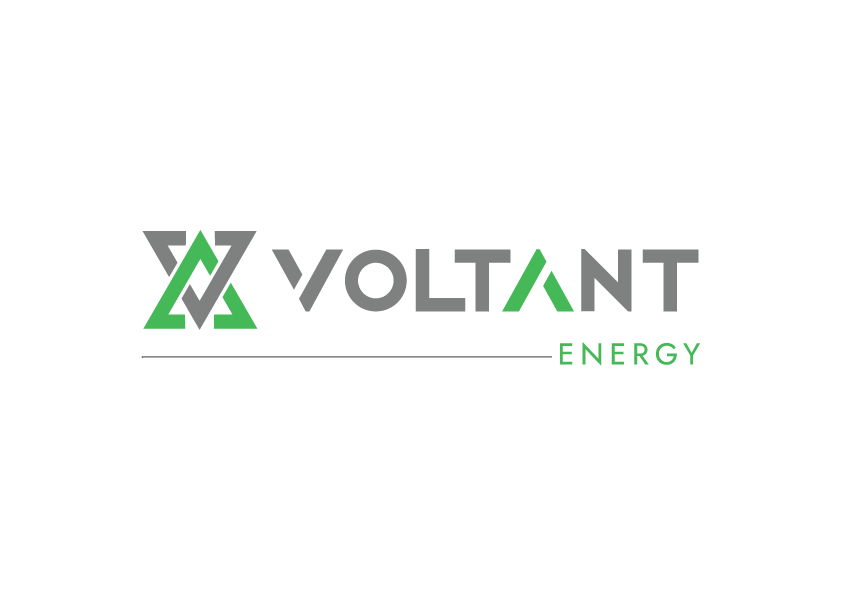
We abstracted her silhouette into two opposing triangles, one pointing up and one pointing down. Interlocked, they form a single mark with a sense of movement, like energy flowing in both directions. That is charging and discharging, giving and receiving, power moving through a network.
The Design
The symbol: Interlocking triangles that suggest the letter V for Voltant, and also a current in motion.
Colour: Steel grey for strength and engineering reliability, and electric green for clean energy and sustainability. The green is also used as a highlight on the “A” in VOLTANT, tying the wordmark to the symbol.
Typography: A clean, geometric, uppercase wordmark. The “ENERGY” descriptor sits below a fine line, in spaced letters that give the lockup a calm, precise finish.
Flexibility: The symbol works alone (ID cards, favicons, embossing) or locked up with the wordmark (signage, apparel).
The Brand in Action
We tested the identity on real touchpoints: storefront signage, staff polos, caps, ID cards with lanyards, embossed stationery, and a dimensional metal wall logo. The mark held up on every surface, in colour and in single-tone.
The Result
Voltant now has an identity with a story its team can tell: energy, force, and clean power. It reads as credible to commercial and government clients and stays recognisable at any scale.
Closing
Good branding isn’t decoration. It gives a company something to stand on. For Voltant, that was a goddess, two triangles and a lot of energy.
Planning a brand with meaning behind it? Talk to Designment Works.